See more art on our front slider: The Floating Piers by Christo. Photo by Wolfgang Volz.
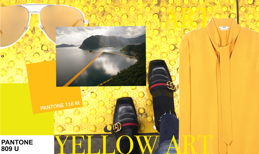
We are in the mood for yellow, the most luminous of all the colours. Especially after walking along the saffron yellow Floating Piers at the beginning of this week we cannot get enough of looking at this shade. Did you know that seeing yellow can actually make you feel hungry? Yellow even stimulates the logical side of the brain and our mental activity. Above all, psychologically, it is optimistic, uplifting and brightens our spirit.
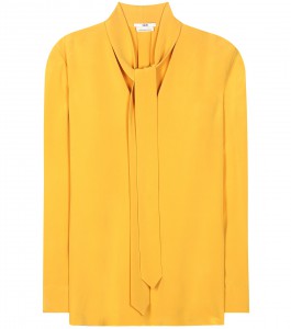
IRMA picked some yellow pieces for her summer trunk and our art historian Marion von Schabrowsky tells us a little art story about the art that came to her mind when thinking of the colour of the sun.
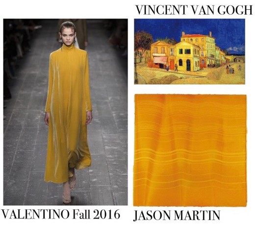
No wonder, that yellow and its numerous tinges played a fundamental role for many artists. Especially Henri Matisse, Marc Chagall or Mark Rothko – just to name a few – based some of their most important works on yellow. However, one artist stands out among all artists – and that is Vincent van Gogh. He was passionate about yellow. Whether is is the ripe ‘Corn fields’ around Arles, which he painted so often, the famous ‘Sunflowers’ or the wonderful ‘Cafe terrace at night” – numerous works were bathed by van Gogh in warm yellow tones.
One of my favourite works is the “The Yellow House” which can be seen at the Van Gogh Museum in Amsterdam. The quirky, two-storey house was the artist’s home in Arles. Van Gogh arrived in the small city in February 1888. It was still snowing but the cherry blossom was already on its way. He came to the south because he wanted to leave Paris behind. The city with its buzzing life was not for him. He preferred nature and solitude. In one of the many letters to his brother he wrote “…I have nature and art and poetry, and if that is not enough, what is enough?”
In Arles van Gogh sought this simplicity of life he was longing for. He found lodging in the small Hotel-Restaurant Carrel near the station. That of course was too expensive for the painter who financially depended on his brother Theo. So, on May 1, 1888 he rented this small house with the slanting walls: “My house here is painted in yellow colour of fresh butter on the outside with green shutters… In this I can live and breathe, meditate and paint.” You might notice that not only the house, but the bridge, the streets, everything is captured in brilliant yellow. Van Gogh chose this startling colour as he wished to express his happiness and joyful anticipation. He hoped that the ‘Yellow House’ would become a “Studio of the South”, where painters could live and work together – an artists’ colony in other words.
The house was a materialization of his desire for friendship, companionship, cheerfulness and art production. The dream soon disappeared as so often in his life. Nonetheless, the yellow house was the place where van Gogh felt happy – at least for a brief moment in time.
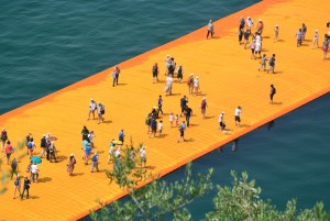
From Arles we travel along the Côte d’Azur, follow the Italian Riviera and arrive at Lake Iseo in North Italy. The lake with its picturesque scenery has become a platform for a captivating art installation: “The Floating Piers” by Christo. The installation was opened to the public on June 18 and will close on the July 03. Christo has installed floating piers, which connect the main land with the two islands Monte Isola und San Paolo. (Read our Tuesday post for more info & pictures.) And guess in which colour the floating ‘Boulevards’ come along? Yes, in yellow – a mesmerising, warm yellow that slightly touches orange.
Christo spent more than two years planning the installation. The costs amount roughly 15 millions euros. The piers consist of a modular dock system of 220,000 synthetic cubes held together with 220,000 screws, and kept in place by 190 anchors weighing five tons each. The piers are covered by a yellow fabric. The total length of the piers is 5.5 kilometres (3.4 miles) and they are 16 metres (52ft wide). This is just enough, because the stream of art lovers, tourists and curious people is enormous.
Christo once said about his wrapped works: “All these works – they are total freedom. Nobody can buy them, nobody can own them, nobody can sell tickets.” And that of course also applies to “The Floating Piers.”. They are open to everyone, and there is no charge for entry. Christo: “There is no purpose. It is about joy and beauty.” What comes to my mind in this context is a quote by Picasso: “Art washes away from the soul the dust of everyday life.” I think Christo does actually just that!

Yellow is in the air everywhere – at least so it seems. The Tate Modern in London has dedicated “Room Two” in the Boiler House to the cheerful colour. Alongside Kandinsky, Ellsworth Kelly and Gerhard Richter, you will find five works of the British painter Maria Lalic. She holds a very interesting position. In contrast to her male colleagues who deploy tones of yellow in their visual and emotional impact, Lalic explores the historical development of pigments, i.e., when they were first used. Maria Lalic established six categories: “Cave”, “Egyption”, “Greek”, “Italian”, “C18/19th” and “C20th”.
Each work in this series includes all the pigments that were available during each era. The overall appearance of each work is of course very different. Compare the “History Painting 2 Cave Yellow Earth” painting with the “History Painting 35 C18/19th. Chrome Yellow” for instance. The “Cave”-painting reveals a brownish yellow, while “C18th/19th” is brighter and clearer. The reason for the difference is clear: During prehistoric times only one pigment was available, namely ‘yellow earth’. So, Maria Lalic could use just this material for her painting. The situation for painters in the 18th and 19th century was very different: more and more pigments were introduced. So, Lalic could apply multiple thin glazes of different tones of yellow. Since the canvases’ outer edges are entirely unpainted, the built-up layers can also be seen when the painting is viewed from the side. Lalic herself says, that the edges can be read “almost like a bar code”, making it possible to “uncover the history of each painting”.
Inspired by so much bright art, IRMA has selected her favourite summer pieces in shades from corn yellow to gold.