Jasmin Khezri: MARTIN ET KARCZINSKI is a corporate design company, isn’t it?
Peter Martin: People always want to put a label on you, categorize you. In our case it would be marketing in the broadest sense. I don’t see it as rigid as that. I would call us a holistic management consultancy company.
We are an identity consultancy, searching for the company’s identity. In its DNA we are looking for three basic aspects, which are, CONTENT- FORM – ATTITUDE.
JK: Could you explain these three fundamental aspects of your work?
PM: The CONTENT is a strategy and what is there to offer.
You need to offer something relevant, so we look at that. How are the circumstances you present your offer, what is the relevance of your product?
Second step would be the FORM. Where and how you present your offer to the audience. How is the journey to get the offer, whether it is brick and mortaror digital? After we have defined the identity, we create the form, but the most important question is, what is the culture and the values of the company. What is the ATTITUDE?
JK: Do you always follow the same method?
PM: Yes, you need to work with an already proven formula, so your clients can trust you.
JK: So, after you have found the identity of the company, what is your next step?
PM: Actually, there are two kinds of identities, internal and external. If the employers are not motivated by their products nothing long-term will happen although you are still trying to activate the offer through marketing.
That is why it is very important that a brand has a strong identity carried by the employees who communicate that massage to the outside world. That is a very strong form of marketing, much longer lasting and effective that again is why starting at the DNA is so important.
JK: Take German Airline Lufthansa for example. What was your main building block when it came to re-define the identity of Lufthansa?
PM: Their values.
JK: How was it at the beginning of your collaboration with Lufthansa?
PM: Lufthansa was already a step ahead when we started working with them. They already knew that they had to change something. They already invested in creating something new, but probably not in a way which supported their real values. At that time, they didn’t have a clear direction yet. But a great product which we had to create a form for.
JK: There must be a big market nowadays in Germany for your concept of CONTENT- FORM – ATTITUDE.
PM: Yes, there is a huge amount of work to do.
JK: How important was the visual language in the case of Lufthansa?
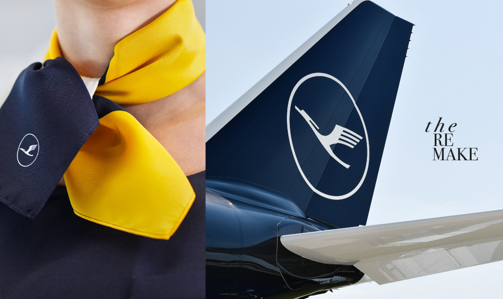
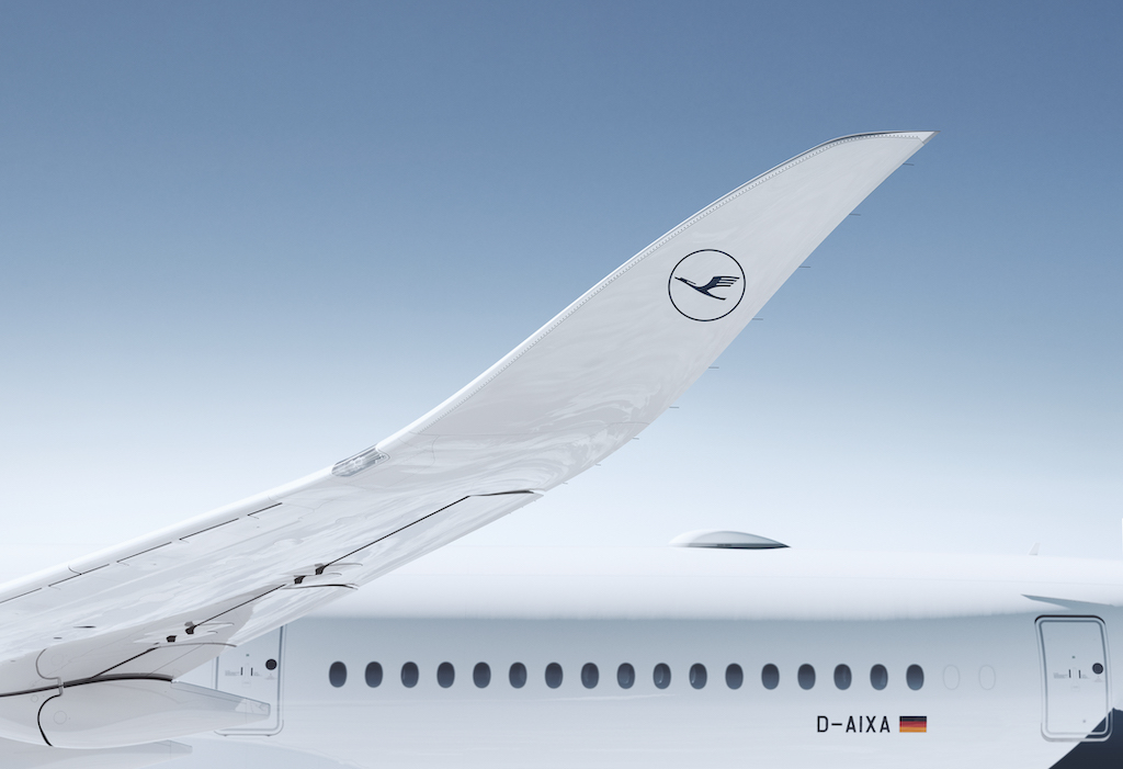
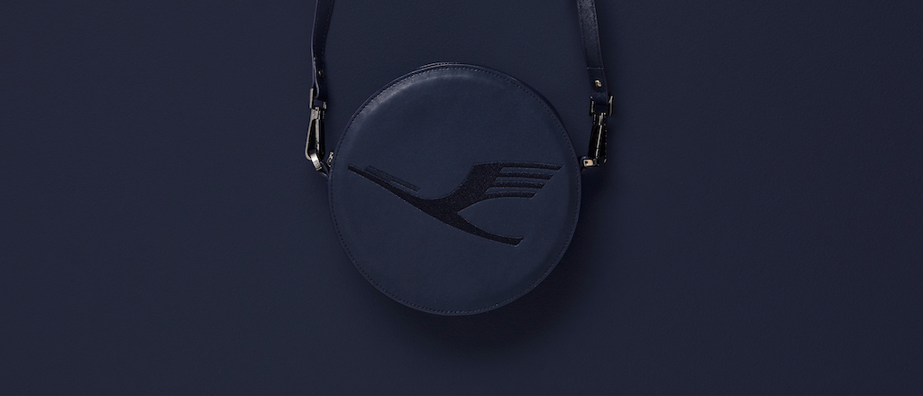
PM: After it became clear that the DNA of Lufthansa should be premium and the lower price Airline was EUROWINGS, we asked a simple question which colour is more elegant: yellow or blue?
The CEO made the decision, blue of course. So, we treated blue as the dominant color to bring Lufthansa back to premium.
This shows very clearly that we are not artists creating new visions, but more connectors between content and form. It is never a question of taste, but to find a solution for a strategy.
JK : “We create a new blue for the sky” , was your slogan for Lufthansa.
PM: Yes, we thought it was a great contrast to Das Spiegelei im Himmel, as Lufthansa was known before.
JK: Why is there still yellow in the brands CI if they want to go fully premium?
PM: Yellow and blue is the learned colour combination of Lufthansa. Yellow supports blue, contrasting it. Keeping the yellow means continuing the tradition, but at the same time shifting the focus on blue, the colour of premium.
JK: What means Lufthansa for Germany?
PM: Lufthansa is a part of German culture, it stands for all German attributes, like security, precision, engineering, punctuality, reduced design. Lufthansa stands for all these aspects. It is therefore not only a brand, but part German culture.
JK: What was the reason behind going premium for Lufthansa?
PM: They decided, you can only be mass market or Premium in the Airline business, not both.
That is why the strategic decision was made to create EUROWINGS, one of the most important budget Airlines in Europe.
With that concept Lufthansa reaches all travellers by having two brands, standing each independently for themselves.
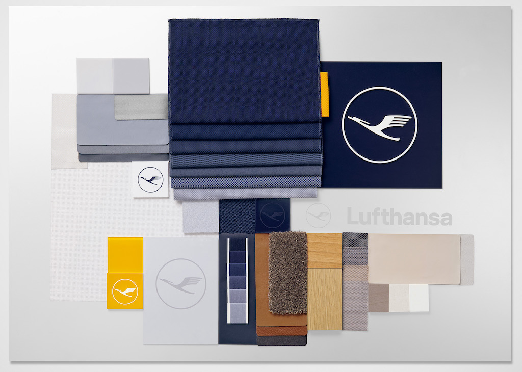
JK: Where did you look for inspiration for the form for Lufthansa?
PM: We travelled to design fares to Milan to look at living concepts which we felt important as Lufthansa has a great variety of touch points, before the travel, the trip itself, afterwards, the Airport, the lounges, the food, the security, city lights, advertisement, the personal….. all touching points for the brand itself. Various living designs of these elements helped us to create solutions for these touch points with Lufthansa in mind
JK : How did you manage to systemize all that?
PM: The question we asked ourselves was, how does the atmosphere of tomorrow feels like?
We thought that moving on international platforms will grab that feeling best. And living and interior besides travel itself are the most effective areas to get the feeling by what we wanted to be surrounded by in the future.
JK: Based on the Lufthansa project, what would you give others as advice?
PM: When talking to decision-makers it is imperative to visualize the consequences of your action. You have to design a presentation that looks like the real thing. To inspire and to comfort the decision-making process. But also to show the far-reaching effect when you change something as significant as a corporate identy.
